Let's build a visual identity for your company that will resonate with your target audience.
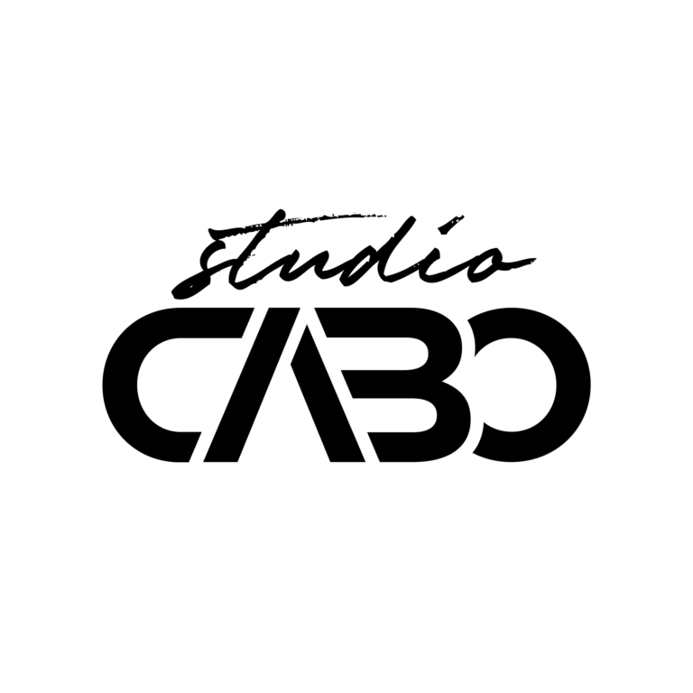
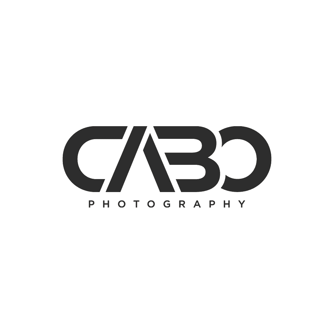
For the CABO Photography project, we developed a text/lettermark logo where the name becomes the logo. We worked on creating a customized version for the word CABO, being unique, simplistic, and minimalist, helping the logo to be memorable and easy to recognize.
Given the client’s activity in wedding photography, the final logo is elegant and offers a premium vibe, expressing high-quality services.
The simplicity of the logo is an advantage, as it is easy to integrate into photos without becoming too much. The watermark provided by this logo is professional.

Do you want a website that inspires confidence and brings you closer to your audience?


