The development of the e-scooter project began with a logo design package that included logo development, the creation of business card and letterhead designs, optimized logos as social media profile pictures, a short logo guide, and a wallpaper with the final logo.
With this package, we laid the foundation for the client’s visual identity. The final logo is a combination of a text and initial logo. As such, the logo can be used as a whole, but the initial can also be used separately as a branding element in the implementation of the visual identity. Examples of such implementations are presented further on this project page.

Let's build a visual identity for your company that will resonate with your target audience.

Once we defined the visual identity for e-scutere, we started implementing it by creating related branding elements that would offer brand consistency.
Among these, there were also several flyer and brochure designs created to showcase the company’s products and offerings. We created double-sided flyers, as well as trifold brochures where multiple products could be presented.


Do you want a website that inspires confidence and brings you closer to your audience?
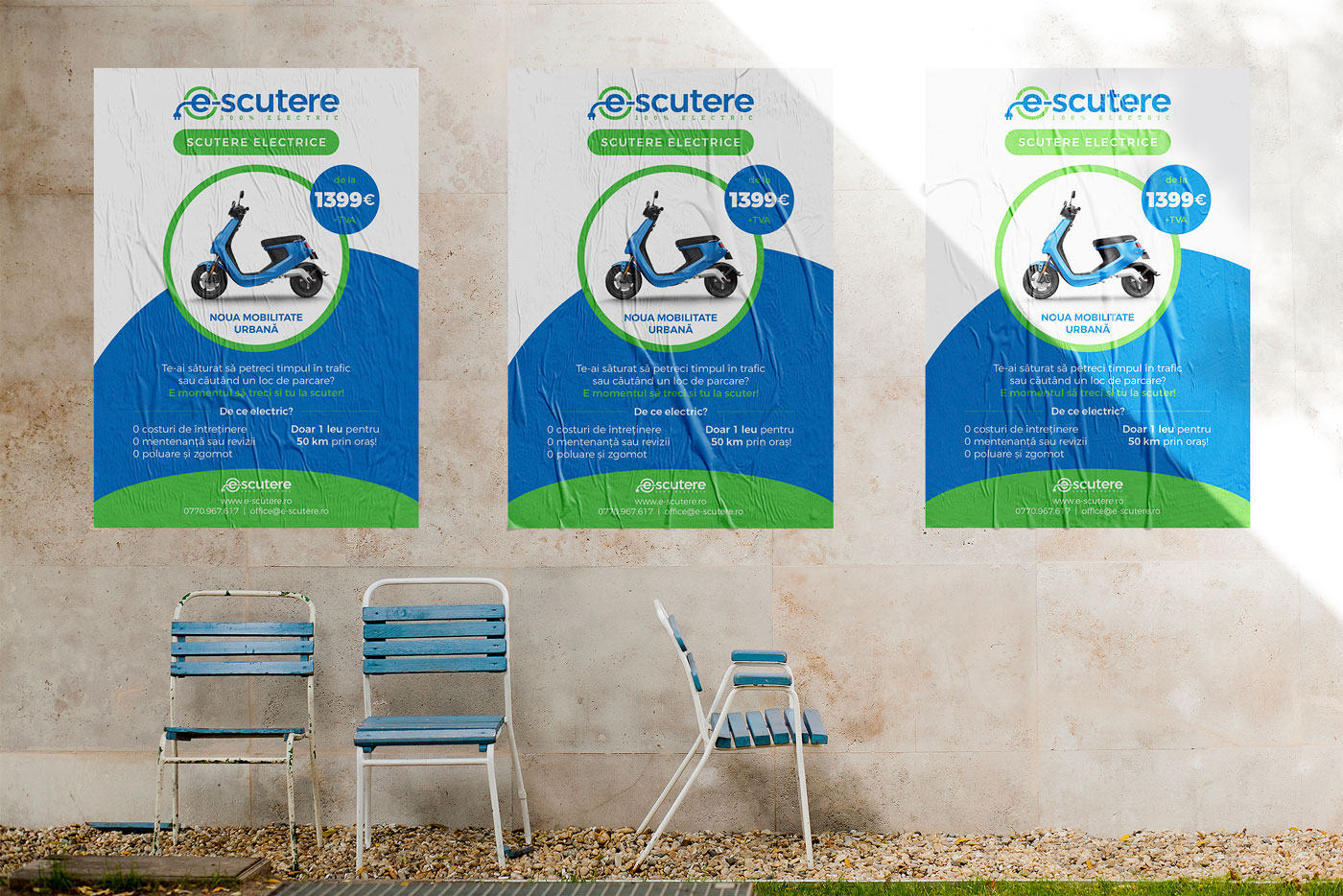
Another branding and advertising element was the creation of an A2 poster for presenting the brand’s offer. The colors defined in the visual identity are a perfect match for the business industry.
Several web and advertising banners were also developed in this project, but our favorite was the large 10×2 meter banner designed to be displayed on a billboard next to a busy road. This is a professional and elegant presentation of the brand’s products, electric scooters and motorcycles, using the colors of the visual identity.