Let's build a visual identity for your company that will resonate with your target audience.
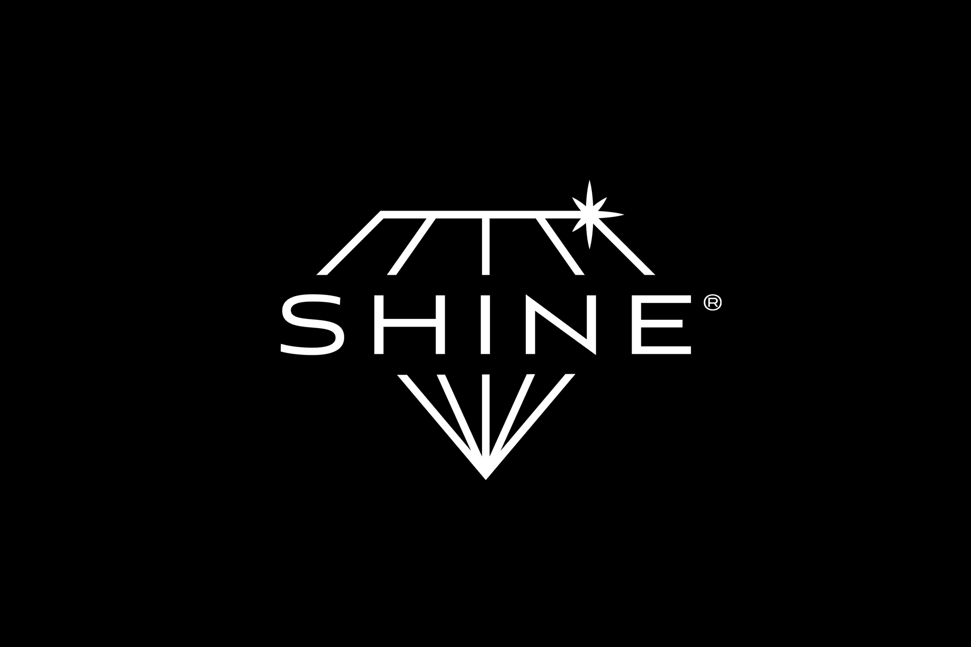


SHINE® is a business that deals with selling own-branded products for teeth whitening and oral care. From electric toothbrushes to strips, foam, and teeth whitening kits.
Our mission was to develop a visual identity that inspires quality, elegance, seriousness, and professionalism. We achieved this by creating a logo emblem that frames the name in a diamond, the significance of which is related to the brightness and health (hardness) of teeth. A secondary text logo was also prepared with the brand name, to be used in situations where the main logo would not fit.
These laid the foundation for the visual identity and helped us develop other design elements to solidify and implement the brand image. You will discover more of these on this page…


Having a strongly defined visual identity, we started to think of creative solutions for product design and packaging. Offering a variety of products required creating a design for each one, but with the purpose of maintaining a stylistic connection between them.
These were the products for which we developed product and packaging design, box and user manual:
- Electric toothbrush.
- Teeth whitening pencils.
- Teeth whitening strips with and without charcoal.
- Whitening foam.
- 3 teeth whitening kits: USB, wireless and with tray.
So far you have seen the toothbrush with box design, logo, teasers of whitening products and website. More to come…
Do you want a website that inspires confidence and brings you closer to your audience?


We have switched to teeth whitening products. In the pictures above, you can see the packaging and boxes for the whitening strips. The ones in black contain activated charcoal, while the ones in blue do not. On purpose 🙂
Also in one of the pictures above, you can see the application of the secondary logo on other products, such as the LED kit for teeth whitening and the syringes with the solution used with this kit.
We then continue with the label and box design for the whitening foam. Following a graphic style similar to that of the charcoal-free whitening strips, as well as the same shades of blue found in the toothbrush box, we have come up with a clean, professional design ready to perfectly represent this product. In the next image, you can see both the individual design models and them applied to the finished product.

However, these are not all the product and packaging design elements for the SHINE® client, but we will move forward with the presentation website created for the same client. If you want to see the rest of the products, visit the website here.
On the presentation website creation side, it was desired to develop a site that would express professionalism, quality, and that would rise to the level of strong competition, namely Philips and Oral-B. The website aimed to present the site’s products in detail, but also to provide links to the platforms from which they can be purchased.
Overall, SHINE® was a client and a project for which we had, once again, the pleasure and opportunity to test our limits, become creative, and develop creative design solutions that we enjoyed!

