Project details
We were contacted by a client – a winery from the commune of Peștera, Constanța – with the desire to develop a representative visual identity for their brand: “Crama Saidia,” as well as the design of their own products and those from subsidiary brands.
The project was developed in several stages, including:
Creating the logo
An essential request from the client was to include a graphic representation of the winery in the logo design. Thus, based on the photos received of the winery from the client, we managed to create – in a minimalist style typical of our work – an accurate depiction of the winery and the fields where the grapes are cultivated.
Another challenge was related to the pronunciation of the brand, specifically “Saidia,” which is correctly pronounced with the accent on the first “i.” Therefore, the solution we offered to the client was to include an accent in the brand name in the logo. This accent became one of the defining visual elements of the brand identity, being used in the brand’s design materials.
The final logo included a primary logo (+secondary, without a slogan) and an emblem, as shown in the accompanying images, both serving practical purposes that you will discover further on.


Creating packaging designs for bag-in-box wines
The next step after defining the basic elements of visual identity – logo, colors, and fonts – was to develop the bag-in-box packaging design. At this stage, I worked on creating a design system that can be applied across the entire range of the client’s products:
- Different types of wine: white, red, and rosé.
- More quantity options: 10L, 5L, 3L, and 2L.
The packaging design was created based on a template provided by the chosen packaging manufacturer, optimized to be ready for printing and packaging. With the packaging already selected, it accelerated the design process and shortened the production time.
Since the design was efficiently constructed, when changing the packaging manufacturer, we were able to easily adapt the design to the new templates.
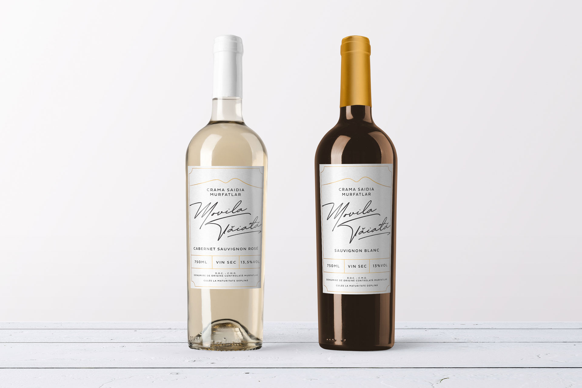
Label designs for wine bottles for subsidiary brands
The next stage in the development of the project was the creation of label designs for two subsidiary brands of the client. Each brand had several varieties of wines, for which label designs were prepared tailored to both the variety and the type of bottle.
The subsidiary brands included:
- Movila Tăiată with: 2 types of bottles and 3 varieties - red, rosé, and white.
- CANARA, a brand of blended wines varieties.
The development of these labels continued in line with the brand identity, using representative colors and fonts. Thus, all design elements represented continuity in the client’s brand design.
A consistent and coherent brand design has several benefits, including:
- Brand memorability: high chances that visual elements of the brand will be easily remembered and recognized.
- Having a visual identity that consistently adheres to the same rules denotes professionalism and seriousness.
- You can control the visual perception of your own brand and adapt it to its evolution and changes.


Visual Identity Manual
The project has been completed with a standard visual identity manual in which we have gathered all the fundamental information about the identity. This information served as the foundation for the development of all the design elements presented so far, and it will continue to serve as the basis for the development of new design materials for the brand.
Brand design conclusion
The brand design is the link between strategy and visual elements. Thus, through these services presented in this case study, we succeeded in transforming solutions into visual elements that help the client achieve their brand objectives.
Whether it involved defining a visual identity that represents the brand or design materials for implementation, we stood by the client, offering our expertise at every step.
Do you also have a business that you want to transform into a brand? Contact us and let’s discuss how we can make that happen together.