Why is a correct implementation of visual identity important for a brand?
You’ve developed a logo for your business, and now you have the basic elements of your visual identity. What’s next? What follows is exactly the part that will make the difference: implementing the visual identity.
First of all, implementing the visual identity is a constant process that begins after the logo design is complete and continues throughout the life of your business. It doesn’t just exist in files or PDF presentations, but comes to life when it is used correctly, repeatedly, and consistently.
If you want to learn more about what visual identity is, read our article: The Differences Between Logo and Visual Identity.
When a visual identity is applied incorrectly, incompletely, or randomly, it can do more harm than good to a brand’s image. Every deviation – different font, different shade, different graphic style – impacts the audience’s perception, the brand’s recognizability, and affects trust in your brand. In this article, we will discuss the fundamental principle that underpins a memorable and coherent visual identity: repetition.
Table of Contents

The fundamental principle of a memorable and coherent visual identity: Repetition
In visual identity, it’s not constant creativity that builds a strong brand, but conscious repetition. When the same visual elements appear again and again – in posts, on websites, on packaging, in documents, etc. – they begin to become an identifiable part of the brand and imprint themselves in the audience’s mind. This is the foundation of visual recognition and memorability.
- Repetition builds familiarity, and familiarity builds trust.
What does repetition in visual identity mean, exactly?
In visual identity implementation, repetition means consistently using the same:
- Fonts and font families - starting with those in the brand's logo.
- Colors (exact, not approximate) - the same, starting with those in the brand logo.
- Layout styles: page arrangements, element placement, framing, etc.
- Additional graphic elements: backgrounds, patterns, icons, shapes, lines, photos, illustrations, etc.
These visual markers – when used repeatedly – become, over time, part of your brand’s identity and identifiers of it.
What does repetition NOT mean?
Repetition in visual identity DOES NOT mean “identical”. Not all your materials need to look the same, but they should utilize some of the same elements – mentioned above – in a repetitive way. This way, all communications visually convey the same identity, even when the content and/or format differs.
Here we can think of a flyer, an Instagram carousel, and a presentation page, which can be completely different in structure and content, but tied together by the same defining visual elements.
What do you gain from using repetition in visual identity?
Using repetition in visual identity helps to increase brand memorability and recognition. Thus:
- Your brand becomes easily recognizable.
- The public starts to associate you with a certain image/identity (that belongs to you).
- Convey trust, professionalism, and responsibility.
- You naturally stand out from the competition.
A memorable visual identity stands out not for its variety, but for its intentionally repeated coherence.
Where and how to apply visual identity consistently
To build and maintain a consistent and memorable visual identity, it must be visible and constant across all touchpoints with the audience:
- Website: colors, fonts, spacing, icons, images.
- Social media networks: posts, story highlights, covers.
- Printed materials: business cards, flyers, brochures.
- Documents: offers, presentations, PDFs, invoices.
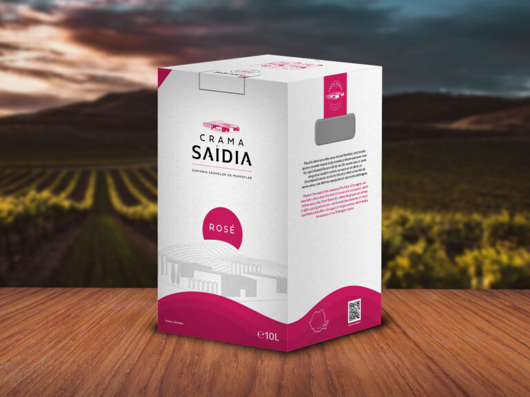
- Packaging and products: labels, boxes, bags, stickers.
- Physical spaces: signage, showcases, uniforms.
Practically, wherever your brand is shown, the visual identity must be present, clear, and coherent.
What happens when you don't respect the visual identity or implement it incorrectly?
Disregarding the visual identity and incorrect implementation creates confusion, affects the recognition and memorability of the brand as well as trust in it.
Some of the most common mistakes we see in implementing visual identity are:
- In social media posts, you use a variety of fonts that differ from post to post. Rarely or never the one from the main element of the visual identity: the logo.
- In the materials you create, use shades of colors or colors that are completely different from those representative of your brand's visual identity.
- Change the brand logo by altering its proportions, colors, or even the arrangement of elements.
- Materials created for different media - social media, packaging, printed materials, etc. - use completely different styles and elements, without following a style that connects them (e.g., different fonts, colors, and graphic elements).
And the list can go on. All these mistakes and incorrect uses weaken your brand in the eyes of the public. Instead of appearing professional, you come off as inconsistent or even negligent.
How to ensure that the visual identity is implemented correctly and coherently
The successful recipes for coherent visual identities are based on graphic systems that they follow. These can be:
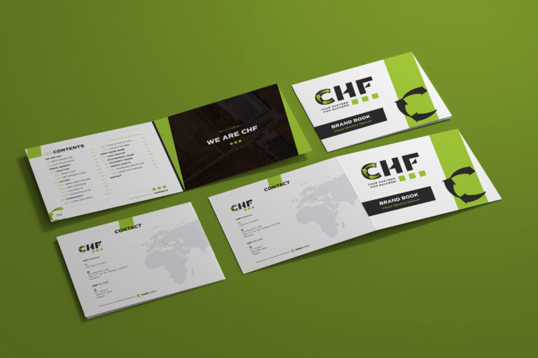
- Visual identity manual – the guide that defines how all elements should be applied.
- Templates – adaptable design models that can be used for a variety of situations. Templates can be for: social media, printed materials, websites, presentations, and more.
- Resource Organization - organizing all resources that form the basis of visual identity into folders: logo, fonts, templates, visual identity guide or manual, graphic elements, etc.
- Make sure that everyone who creates materials (freelancers, employees, collaborators) has access to these resources and knows how to use them.
Conclusion: a consistent visual identity doesn't happen by chance
A coherent and memorable visual identity does not occur by chance; it is the result of correct and consistent implementation across all visual materials of the brand throughout its existence.
After you have invested in a custom and professional logo design, do not let the visual identity evolve haphazardly. Ensure that defining elements are implemented correctly, consistently, and across all touchpoints. A coherent visual identity will constantly work in favor of your brand.
Do you need an easy-to-implement visual identity, or help applying it?
Together we can work on establishing an easily implementable visual identity for your business, as well as on the correct and coherent implementation of that identity.